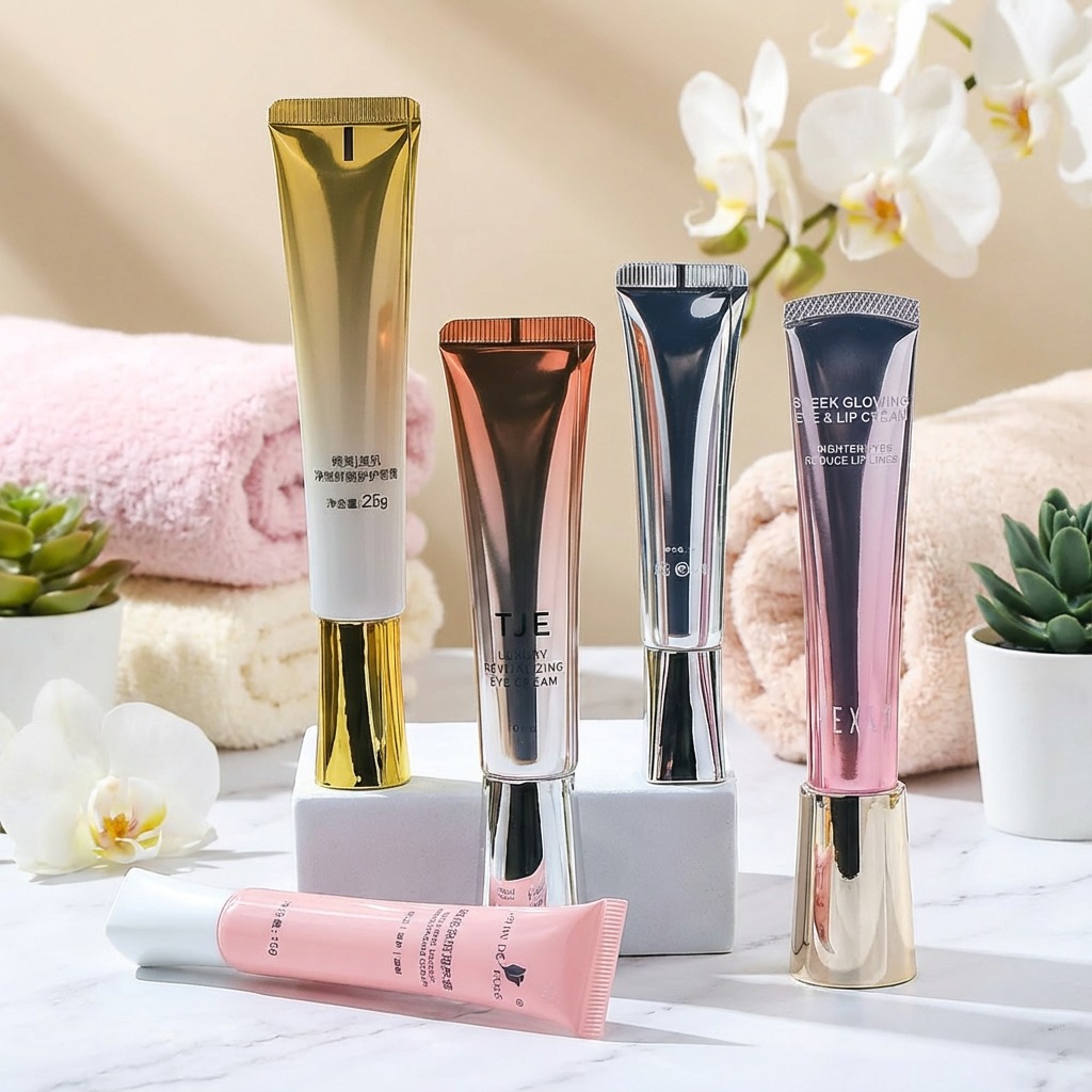
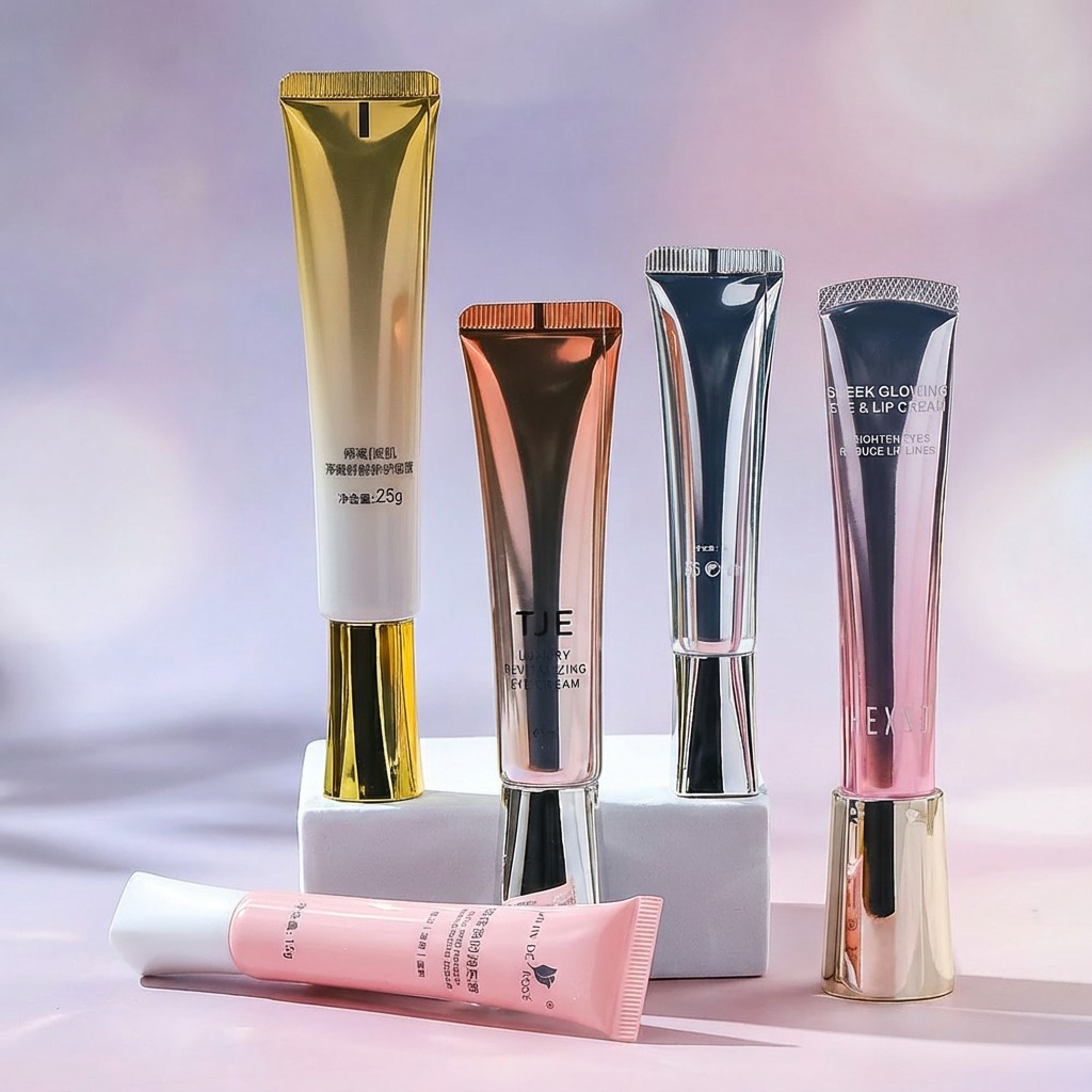
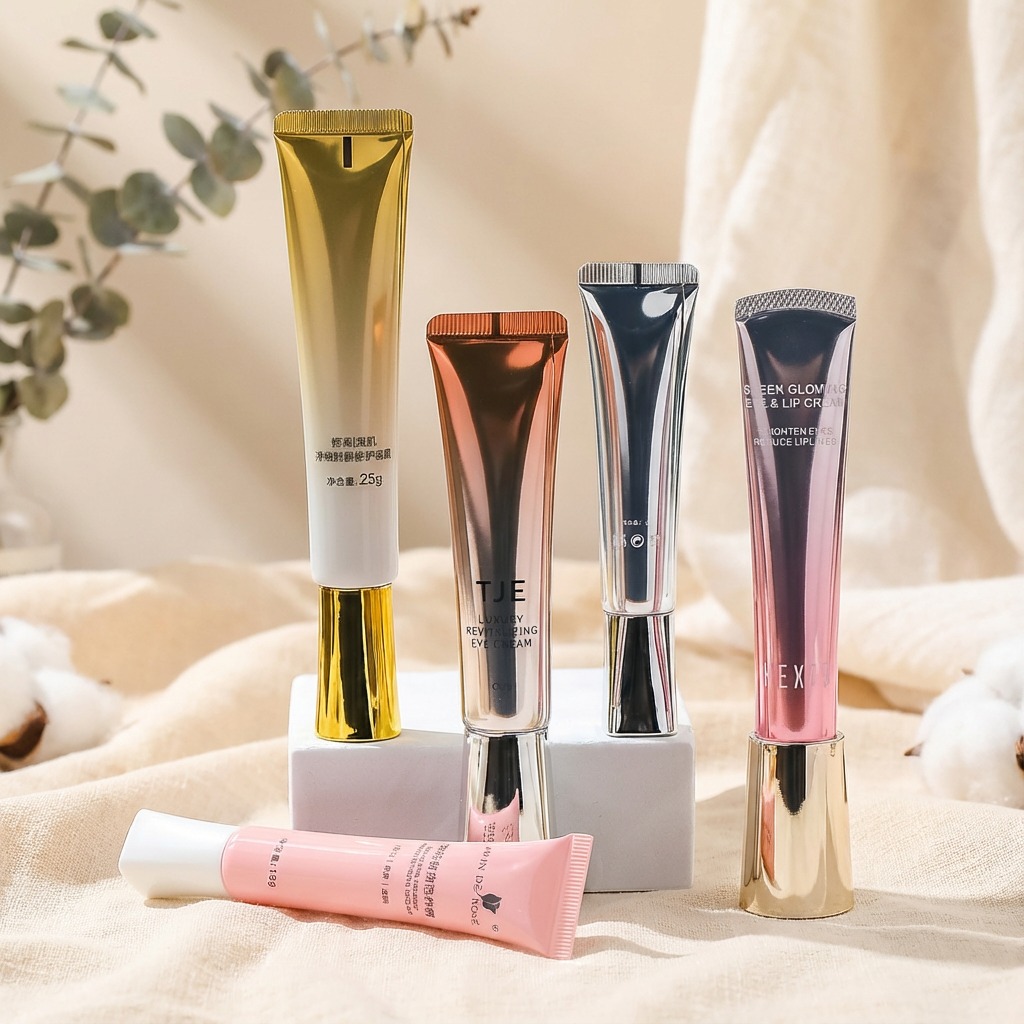
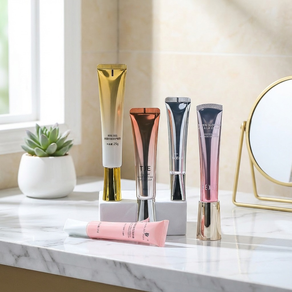
In the highly competitive world of beauty and skincare, the first impression is often the most lasting. Before a cream is even felt or a serum is applied, the packaging speaks volumes about the quality, philosophy, and luxury of the product within. It is the silent ambassador for the brand. A standout example of this principle in action is the modern and sophisticated cosmetic squeeze tube 100ml silver matt. This specific design choice represents a larger trend towards minimalist elegance, promising a high-performance product that is both stylish and functional. It’s a testament to how thoughtfully designed containers can elevate the entire user experience, transforming a daily routine into a ritual of indulgence and care.
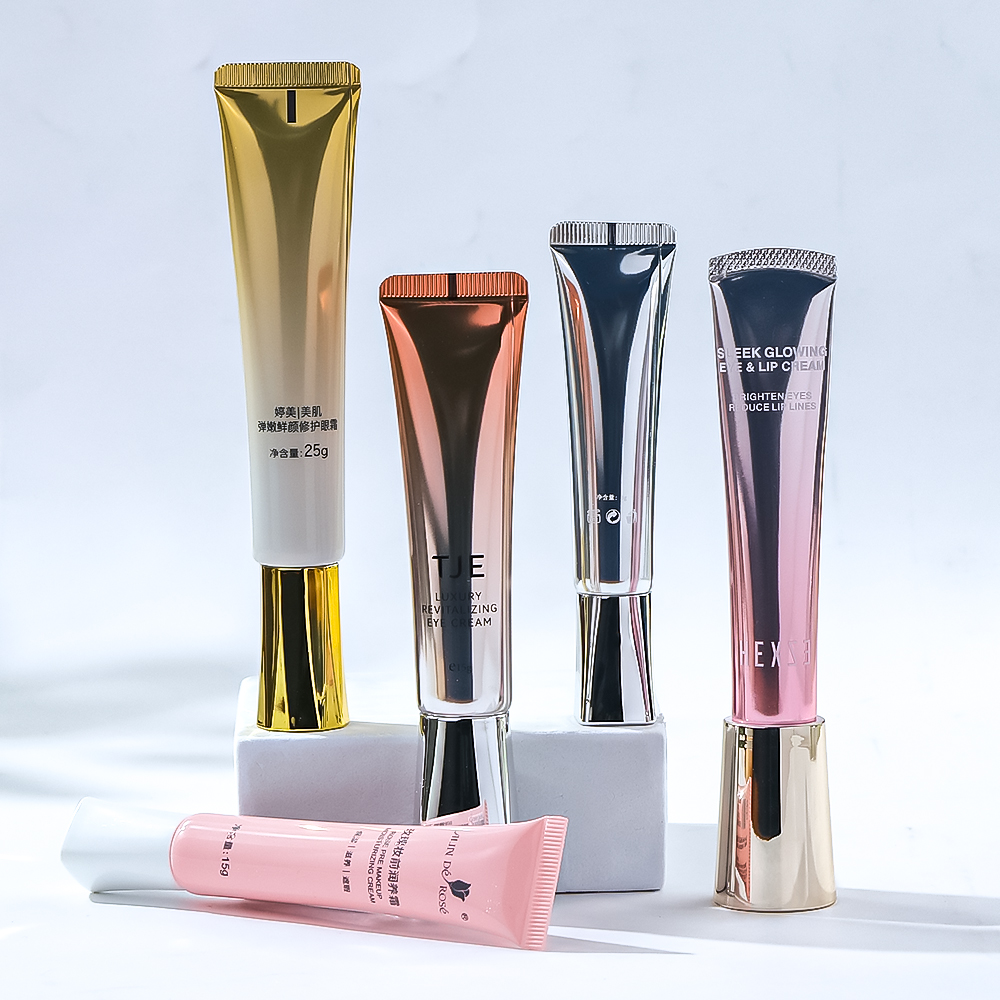
Across the beauty landscape, metallic finishes have become synonymous with luxury and efficacy. They catch the light and the eye, suggesting a product that is rich, potent, and valuable. We see this in the opulent, golden-hued tubes that promise rejuvenation and a youthful radiance, their shimmering surfaces reflecting the premium ingredients inside. Similarly, a copper-toned or rose-gold tube, like that of the TJE Luxury Revitalizing Eye Cream, embodies refinement and high-performance skincare. This metallic sheen is not just decorative; it’s a strategic choice that communicates a brand's commitment to excellence. It creates a visual and tactile promise of the transformative effects contained within, making the product feel like a precious commodity before it is even opened. This aesthetic choice aligns with formulations that often feature advanced, scientifically backed ingredients, bridging the gap between indulgence and results.
The cosmetic squeeze tube 100ml silver matt offers a different, yet equally powerful, form of sophistication. Unlike its shinier counterparts, the matte finish absorbs light, creating a soft, velvety appearance that is both modern and timeless. This understated elegance speaks to a confident brand that doesn't need to shout for attention. The silver color itself is often associated with cutting-edge science, purity, and precision, making it an ideal choice for high-performance serums or targeted treatments like a night renewal serum or an ageless eye cream. A matte texture adds a tactile dimension, feeling smooth and luxurious in hand while resisting fingerprints, maintaining its pristine look through repeated use. This design choice appeals to a consumer who appreciates minimalist aesthetics and values substance over overt flashiness, suggesting the product inside is serious, effective, and expertly formulated.
Beyond its visual appeal, the squeeze tube format is a marvel of functional design. Its primary advantage lies in hygiene and product preservation. By minimizing the formula's exposure to air and contaminants, the tube helps maintain the stability and potency of active ingredients, from delicate antioxidants to powerful retinoids. This is a crucial consideration for advanced skincare formulations. The format also allows for controlled, precise dispensing, ensuring the user gets the right amount of product every time, which reduces waste and makes the product last longer. Innovations like roll-on applicators, as seen in some anti-fatigue eye gels, further enhance this functionality by adding a massaging effect that can boost circulation and product absorption. The 100ml volume is generous, offering substantial product for daily use, while still being conveniently portable and compliant with travel regulations for carry-on luggage, making it a perfect companion for a modern lifestyle.
While a cosmetic squeeze tube 100ml silver matt communicates a specific message of sleek performance, the broader color palette in cosmetic packaging tells a diverse range of stories. A rose-pink tube, for instance, often suggests a product focused on glowing, dual-benefit properties, like a cream designed for both eyes and lips. A soft, pastel pink can imply a gentle, nourishing, and foundational skincare step. On the other hand, the crisp white and vibrant orange of a product like Green People’s Bio Active Eye Cream effectively communicates its organic roots and energizing, bio-active ingredients. Each color choice is a deliberate branding tool used to connect with a target audience and instantly convey the product's primary benefit. This strategic use of color psychology enriches the consumer experience, helping them navigate a crowded market and find the product that perfectly aligns with their needs and values.
Ultimately, the packaging of a cosmetic product is far more than a simple vessel. It is an integral component of the product's identity and the consumer's overall experience. It sets expectations, communicates brand ethos, and adds a touch of pleasure to the daily act of self-care. The journey through various designs—from the radiant warmth of gold to the clean, clinical appeal of a cosmetic squeeze tube 100ml silver matt—reveals a deep understanding of the modern consumer's desires. They seek products that are not only effective but also beautiful and a joy to use. By masterfully blending aesthetic allure with user-centric functionality, brands create a holistic and luxurious experience that resonates long after the cream has been absorbed, proving that true quality is present in every last detail.
The Opulence of Metallic Tones
Across the beauty landscape, metallic finishes have become synonymous with luxury and efficacy. They catch the light and the eye, suggesting a product that is rich, potent, and valuable. We see this in the opulent, golden-hued tubes that promise rejuvenation and a youthful radiance, their shimmering surfaces reflecting the premium ingredients inside. Similarly, a copper-toned or rose-gold tube, like that of the TJE Luxury Revitalizing Eye Cream, embodies refinement and high-performance skincare. This metallic sheen is not just decorative; it’s a strategic choice that communicates a brand's commitment to excellence. It creates a visual and tactile promise of the transformative effects contained within, making the product feel like a precious commodity before it is even opened. This aesthetic choice aligns with formulations that often feature advanced, scientifically backed ingredients, bridging the gap between indulgence and results.
Understated Elegance: The Silver Matte Finish
The cosmetic squeeze tube 100ml silver matt offers a different, yet equally powerful, form of sophistication. Unlike its shinier counterparts, the matte finish absorbs light, creating a soft, velvety appearance that is both modern and timeless. This understated elegance speaks to a confident brand that doesn't need to shout for attention. The silver color itself is often associated with cutting-edge science, purity, and precision, making it an ideal choice for high-performance serums or targeted treatments like a night renewal serum or an ageless eye cream. A matte texture adds a tactile dimension, feeling smooth and luxurious in hand while resisting fingerprints, maintaining its pristine look through repeated use. This design choice appeals to a consumer who appreciates minimalist aesthetics and values substance over overt flashiness, suggesting the product inside is serious, effective, and expertly formulated.
Where Innovative Design Meets Practicality
Beyond its visual appeal, the squeeze tube format is a marvel of functional design. Its primary advantage lies in hygiene and product preservation. By minimizing the formula's exposure to air and contaminants, the tube helps maintain the stability and potency of active ingredients, from delicate antioxidants to powerful retinoids. This is a crucial consideration for advanced skincare formulations. The format also allows for controlled, precise dispensing, ensuring the user gets the right amount of product every time, which reduces waste and makes the product last longer. Innovations like roll-on applicators, as seen in some anti-fatigue eye gels, further enhance this functionality by adding a massaging effect that can boost circulation and product absorption. The 100ml volume is generous, offering substantial product for daily use, while still being conveniently portable and compliant with travel regulations for carry-on luggage, making it a perfect companion for a modern lifestyle.
A Spectrum of Style: The Power of Color in Branding
While a cosmetic squeeze tube 100ml silver matt communicates a specific message of sleek performance, the broader color palette in cosmetic packaging tells a diverse range of stories. A rose-pink tube, for instance, often suggests a product focused on glowing, dual-benefit properties, like a cream designed for both eyes and lips. A soft, pastel pink can imply a gentle, nourishing, and foundational skincare step. On the other hand, the crisp white and vibrant orange of a product like Green People’s Bio Active Eye Cream effectively communicates its organic roots and energizing, bio-active ingredients. Each color choice is a deliberate branding tool used to connect with a target audience and instantly convey the product's primary benefit. This strategic use of color psychology enriches the consumer experience, helping them navigate a crowded market and find the product that perfectly aligns with their needs and values.
More Than Just a Container
Ultimately, the packaging of a cosmetic product is far more than a simple vessel. It is an integral component of the product's identity and the consumer's overall experience. It sets expectations, communicates brand ethos, and adds a touch of pleasure to the daily act of self-care. The journey through various designs—from the radiant warmth of gold to the clean, clinical appeal of a cosmetic squeeze tube 100ml silver matt—reveals a deep understanding of the modern consumer's desires. They seek products that are not only effective but also beautiful and a joy to use. By masterfully blending aesthetic allure with user-centric functionality, brands create a holistic and luxurious experience that resonates long after the cream has been absorbed, proving that true quality is present in every last detail.